
LandlordMax Property Management Software Website Re-design Explained
We’ve put in a lot of research and effort into this upgrade. We’ve studied as much as we possibly could on web site design and therefore today’s article will be focused on what we’ve done that’s new and why it’s good and helpful to our customers. Also, by doing this, hopefully some of you out there can take away with you some of the valuable lessons we’ve learned along the way.
Before I begin, I’d like to recommend a really good book which I’ll be adding to the review section in the next while, Call To Action: Secret Formulas to Improve Online Results, written by Bryan Eisenberg and Jeffrey Eisenberg. These two individuals have put together one of the best books I’ve ever seen on web site design as related to usability and sales. If you haven’t already heard of this book, I’d recommend buying it from Amazon.com
as soon as you can. For about $15-20, which is very cheap when you consider that comparable books are much more, will quickly give you back that value in sales alone, never mind the positive feedback and goodwill your site will get.
I’ve also found a few other great sites I’d like to recommend, MarketingSherpa.com and GrokDotCom.com. They both have excellent articles and information to help you better design your web site. A few other sites I found very informative, but more for software companies, are SoftwareCEO.com and MicroISV.com, and especially JoelOnSoftware.com. These three last sites also contain a wealth of information.
Getting back to our web site, we wanted to achieve certain objectives, as well as enhance others that we already had. Some of these include:
- Make the web site even easier to use and understand than it was before. Minimize what the user needs to know to effectively use the web site.
- Continue to make the web site even more navigatable.
- Continue to increase our sales conversion ratio (which companies doesn’t want to do this!).
- Create action paths, help give our customers better direction on where to go next.
- Share our other customer’s success stories and testimonials in a more prominent way.
- Create a way for others to share their successes with the software. We’ve had lots of great positive feedback, but generally as one line sentences in emails. This is great! Don’t get me wrong, rather what we wanted to expand was the ability to give others a better feel of how our customers use and value the software.
- Link this blog to the company to give LandlordMax a more personalized feel, to show that we’re humans too, that we do care about our customers and that we’re not just a bunch of people hiding behind a faceless corporate identity.
- Reduce, or better yet, create a better sense of localized sections on the web site.
- Express more the benefits of the software than the detailed features, to give people a better sense of what we’re trying to sell rather than overwhelm them with the details of what the software does.
- Provide a better mechanism through the web site for people to quickly and easily get the trial version or purchase the software.
- Update our Referral Reward Program to our new third party service provider (ShareASale.com) that we’ve now officially migrated to.
- We also wanted to simplify our purchase process, remove required fields that we could live without. For example, we no longer ask for the phone number in the purchase process. Before we requested the phone number in case someone entered in their email wrong (which does happen). Then we’d phone them to get the correct email. However after some analysis we realized there’s no reason to ask everyone this information for only 0.25% of the people who make that mistake.
We wanted to at least achieve all these goals. And we also wanted to use as many usability and marketing principles as possible, to give our customers a better overall experience. For example, from one of the lessons we learned is that each additional click a customer needs to do to perform an action almost exponentially reduces the probability that they will fully complete the action. In other words, if you want someone to purchase or try your product, then don’t make them go through many screens entering lots of data, make them go through as few screens as is absolutely necessary. If you want to provide support, make it obvious and make it quick and easy to get to.
In this article, I’ll try and share with you as best as I can how we tried to achieve each of these goals. What did we do and why. Hopefully by sharing with you it’ll give you a better understanding of web site design, of everything that’s involved. And in the best case, you can take something home with you to apply to your own web site!
Make the web site even easier to use and understand. Minimize what the user needs to know to effectively use the web site.
We tried to use as many of the usability design principles as possible to make the web site as easy as possible. Some of the studies we read showed that using a black font on a light background was far more effective than a light font on a dark background. We also had some customers ask that we increase the font size, which we did. We also used bold much more extensively than before, making sure that the key aspects of any particular page were bolded, to make them standout.
We also used what is called a “blur test”. That is, if you look at a web page (or any piece of software) with your eyes unfocused (where you can’t see any detail), are the sections of the web site grouped together in a cohesive and understandable way? Are the sections clearly defined and separated? Does the site flow? Our previous web site passed the blur test, but we wanted to really push it to another level this time. For example, on our home page each section is another color. The left side is the navigation. The middle orange section is the main focus point. The right side is a grouping of success stories. The header is a different color and has a distinct purpose. The bottom of the web page has a white section, which is used for the remainder. On the purchase page, the items are grouped together. On the checkout page, the web page is divided into three separate categories, the shopping cart, the billing information, and the credit card information. We’ve tried as much as possible to group the sections together.
Usability designs also suggest that people scan a web site from top left to top right, going down row by row, and then finally going back to the center of the page where they anchor themselves for the remainder of their stay. Because of this, we’ve put our logo on the top left, to immediately let our customers know that they’ve indeed come to the right web site. For example, if you click on a link, the first thing you want is validation that you are where you expect to be. The next time you click on a link, take a second to make a conscious effort to see what you do. Most likely you’ll take a micro second to look for validation of where you are.
After the logo, we put the two most common actions in the header, the Buy Now and Try Now options. These are the second things all our visitors will see. By putting them directly in our visitor’s the visual path, we make it easy for them to find these actions.
The next thing we did is leave the navigation menu on the left side. There have been lots of usability tests on navigation menus, and the general consensus is that the left side of the page is where the majority of people look for direction.
Following this, usability studies suggest that most people focus on the center of the page. This is where they expect to see and learn about your product. You have about 5 seconds to make a first impression. Therefore what we did is push the focus to the center of the page, where we express the benefits of the product in very few points, that is how it can help the customer. If you calculate the time, 5 seconds doesn’t give you a lot of time, so you really need to limit the text here.
Studies have also shown that what is on the right side of a page generally stays in the peripheral vision or it’s used for validation on the actions to be taken. In other words, this is where reinforcements should go, our relevant information. We decided to place our success stories here since it fit the bill perfectly and also helped us achieve our goal of more prominently displaying them.
Of all the sections on the screen, the bottom is generally the area most skimmed through. That is, people take a quick look here and move on if there’s nothing interesting. It’s also often been suggested that it’s a “where do I go from here” place. Therefore what we’ve done is provide future possible paths that might be of interest. Here we give our users the options of reading more success stories, of going to this blog and finding more information, and we tell them about our success stories contest. This is a great place to give our users alternative paths.
The choice of colors is also very important. We originally chose them when we started LandlordMax Property Management Software 2 years ago. We chose blue because it conveys stability, truth, confidence, security, calm, reliability, basically all the attributes you would want a company have. With that we also chose orange because it conveys cheerfulness, warmth, enthusiasm. We wanted to convey that LandlordMax is a stable, reliable, and secure company that is always happy and enthusiastic to help you solve your problems. We believe these two colors convey what we are trying to do.
Continue to make the web site even more navigatable.
We believe we achieved this goal by keeping the menu on the left as discussed above. According to the studies we read, this is the most intuitive location for navigation.
Another change we did is try to use action words for links. That is, rather than saying “To read more success stories, click here”, or “Click here to read more success stories” where the words “click here” are highlighted, we changed the text to action words, such as “Read more success stories” where the whole sentence is highlighted. You can see this link on our front page.
We also adjusted the links in the navigation menu, where possible, to this type of wording. For example, rather than “Support”, we now call it “Get Support”. “Screenshots” has been changed to “See Screenshots”, and so on. Although these are minor changes, they do help, and taken as a whole a lot of pennies can quickly add up to many dollars in terms of usability.
Going back to this concept, basically the idea is to link an action rather than talk about it and then link a token (such as the words “click here”). This makes the link that much obvious because you can quickly scan for links on a web site, where as if we used click here, you’d have to take the extra effort of scanning the text before and/or after to see what the link is about. Now all you need to do is read the linking text.
Continue to increase our sales conversion ratio
Most of the work for this goes back to making the web site easier to use and understand. Also, as I mentioned before, we’ve tried to make the first 5-7 seconds more important, to attract attention and keep it. We’ve focused more on listing the benefits rather than the features because the free 30 day trial demo will show you all the features in detail. Nothing lets you know better if something works for you than trying it for yourself.
We’ve added success stories and testimonials to the first page, to show our customers that other people like them are using the software and getting some real value out of it. We’re definitely sharing more of the positive feedback we get. One of the things we haven’t done yet but is scheduled to be updated is to add some testimonials to the purchase page, to help bring home the point that other people are using the software very successfully.
As we mentioned before, we’ve reduced the number of fields required in the purchase process. The phone number is no longer being used. Because of this and some other changes, we’ve really been able to condense the purchase process and make it that much faster and easier.
We’re also planning on adding a Better Business Bureau seal on the purchase page. I haven’t yet had the chance to look into the details of acquiring one, but I believe that would help. I also recently read about something called a “Hacker Safe Certificate” that a web site can acquire that has been gaining momentum in the market. Until I know the details, I can’t promise that we’ll add it, but I’m very interested in looking those up as soon as I have a chance. We’re also planning on displaying our SSL certificate seal from the company we deal with to show that all our credit card orders are secured through encrypted channels and that we’ve been verified as an online merchant.
We also repositioned and enhanced the Buy Now buttons on the first page for customers coming back after the trying the software and looking to purchase. Before we had a “Purchase” button on the menu and a small “Buy LandlordMax Now” button in the middle of the page surrounded by other text. Now the wording is condensed and consistent throughout (“Buy Now”) and it’s very easy to find. Based on the studies we’ve read, because it’s in the header it will be one of the first things someone sees coming the web site. Also, once you’re on the page for more than 5 seconds, you’re focus will most likely be on the center of the page, therefore we added it again in that prominent position too.
Additionally, we did the same thing with the “Try Now” button. Before we had “Download LandlordMax Now” near the bottom of the page, a less visited section. We wanted to really make it easy for new customers to find and download the trial version so we added it to the header and the center of the main for the same reasons as the Buy Now button.
Create action paths, help give our customers better direction on where to go next.
Again, this is going back to calls to action. For example, if you want to try the software now it’s much more obvious. If you’re looking to buy it that path has also become more obvious. Getting support is more obvious. For all the reasons mentioned before, we basically worked to give our visitors more hints and suggestions on how to accomplish what they want to do.
Share our customers success stories / testimonials in a more prominent way.
As I mentioned before, we’ve done this by showcasing them on our front page, and hopefully soon on our sales page as well. We’ve enhanced our success stories page to make it better than before. We’ve also started a contest as a way for us to thank people for sharing their stories with us. Not only is it motivating for our customers to hear the success of others, its also even more motivating for us personally to know that we’re really helping people out there! That they’re getting some very real value from our work and effort! I can’t tell you enough how motivating it is to me personally.
Create a way for others to share their successes with the software
Just discussed in the section above.
Link this blog to the company, to give LandlordMax a more personalized feel, to show that we’re humans too, that we do care about our customers and that we’re not just a bunch of people hiding behind a faceless corporate identity.
The link is right there on the first page now.
I’d like to take a moment to explain what this blog is about. I’ve personally looked at many blogs and what I can tell you is that most of them are boring and dull! I’m not joking, most of them are really boring. They talk about what the author ate that day, what they did, they rant on about this or that. They basically talk about personal stuff, things that you would share with your immediate family, things that would bore everyone else. Nothing personal or bad about it, that’s just the way things are.
I created this blog for an entirely different purpose, I wanted to bring meaning to our company, to help our customers get more value. I wanted to share everything I’ve learned in my journeys, as well as share all the great information many of you have sent me! The idea of this blog is to talk about things that are interesting to people such as yourself, not to talk about the trivial things that happen to me each day. It might be exciting for me, for my immediate family, but I really doubt that it would be exciting to you.
With that being said, the main focus of this blog is about real estate. Being highly involved in the real estate investment market, the majority of the articles here are indeed about real estate. I try to limit opinion pieces and instead focus on informational pieces, but that’s not always possible. For example, we have an article on how the interest rate can greatly affect the prices of mortgages. This is not an opinion piece, it’s a factual piece. It’s received a lot of attention through a press release and was republished with many media outlets, over 1200 media outlets to be precise!!! These are the kinds of articles I want to provide, interesting and informative.
Along with these real estate related articles, I’ll publish the odd business related article, to help give our customers a better understanding of running a business, of why certain decisions are made, of how things work. Hopefully by doing it will give them a better appreciation of what’s involved and why things are the way things are at LandlordMax. For example, the article The 3 Essential Rules That Guarantee a Successful Business really helps to drive home what we’re about. If I believe these are the 3 most important aspects of business odds are that I will implement them to the best of my ability. So for example, if maximizing profits is my number one goal, you can expect to see compromises. However, if making my customers experience the easiest possible, then you can tell that if I have a choice to make between adding 2 complex features or picking one complex feature and making it very easy to use and postpone the second feature to another version, I’ll take the latter and only add one easy feature.
After that, you’ll also find some articles directly related to LandlordMax Property Management Software, such as this one. I believe that explaining what we’re directly doing in the company will probably give our customers a better appreciation of us. Sometimes we need to make some difficult decisions which is part of running a business, but hopefully by sharing more of the who, what, when, where, and the why, we can give a better idea of who we are to our customers. Basically I’d like to let them know what they can expect from us in the future.
Reduce, or better yet, create a better sense of localized sections on the web site.
Compared to our last design, we’ve definitely enhanced this aspect, especially on the main page. Rather than just separate the sections with lines, we’ve gone as far as color coding the whole section! Hopefully by making it more obvious where to look, it will help our users navigate the web site that much easier. The less homogenous a web site is, the easier it is to differentiate what is what.
Express more the benefits of the software than the detailed features, to give people a better sense of what we’re trying to sell rather than overwhelm them with the details.
In our previous design, where we now display the orange section, the text there was very feature oriented. We expressed some of the major features of the software, such as over 100 reports, unlimited data, and so on. Although going this routes lets our customers know how we solve their problems, it doesn’t directly address how they benefit from it. That is, we’re going about it in an indirect route, through inference. So for example, if a car mechanic tells me I have a 105 mpg fuel efficiency rating on my engine, then I probably have an incredibly highly efficient engine. That’s great, it’s a great feature! But as a customer, what does that mean for me? Or better yet, how does that translate to a benefit to me? Rather than try to explain what a high efficiency engine means, what if instead of saying “High efficiency engine that gets 105 mpg” I said “Driving this car will greatly reduce the cost of your gas”? Which one better describes the benefits of the solution I provide to the customer? In the first one I have to make an inference, a deduction. In the second, I know what’s in it for me. If I want I can dig deeper and find the details. For example, how many of you right now can tell me accurately how many miles you get per gallon with your car? I suspect that only a very small portion can. But if I asked you how much does an SUV cost in gas as compared to a small economy car, you can say that the economy car cost a lot less.
If you can quantify the benefit, for example, an economy car will save you $5000 in gas over a year, then that’s a much more powerful benefit. However, the reality is that you can’t really do this. How do I know what car you’re driving now? How can I correctly infer the savings? The truth is I often can’t. But if I know you’re driving an SUV, I can infer that the gas costs will be much lower. Therefore, the idea is to try to make your benefits as quantifiable as possible, such as “You’ll be up and running in under 15 minutes”. This gives the customers an idea of what to expect, that they won’t have to read a dense manual just to start the software.
What we’ve therefore done with on LandlordMax is flushed out the benefits from the features we had before. For example, we offer one price to everyone, no matter the number of units or data you enter. Common in property management software (aka. landlord software) is to have tiered pricing based on the number of units you enter. We don’t like this model, we believe it’s unfair. We look at it like Microsoft Word. Should the price change based on the number of documents you read and write? I don’t think so. Should the price of your car change based on the mileage you drive? Probably not. Going back to features, based on our market space, that’s a great feature. It means that you don’t need to determine which category of real estate investor you’re in, nor do you need to worry about growing your real estate portfolio. So rather than say something like unlimited data entry, we flushed out the benefit to the user as: “One price for everyone. The price does not increase as you increase your real estate portfolio.”
Another major feature we have over our competitors is that we’re by far the easiest property management software in the market today! That’s great and all, but what does that mean to our customers? Does it really give them something? Yes, ABSOLUTELY! It reduces their frustrations, but even greater is that it reduces the time they have to spend using the tool and increases the time they have to invest. For example, do you want to learn to use Microsoft Word or would you rather just write your letter/document? I’m personally much more interested in the letter than learning Microsoft Word. I don’t really care to learn it inside and out, I just want to write my letter, so let me focus on writing my letter. I didn’t buy the software to play around with Microsoft Word, I used it as a tool. It’s a means to an end, so make it that. Many software solutions out there seem to think that its up to the user to learn to use their software. I don’t believe that’s right. Do you need to learn to use a TV or is it very intuitive? What about making a phone call? The whole idea of a phone is to call someone, not to learn the intricacies of how phones work or how the phone company transmit your conversation over their network. I honestly don’t care. Do you? Same with a car. Do you know how an engine works? Should you need to know? No. We simply don’t have time to learn everything, so we need to have shortcuts. I want to be able to turn the key, turn the wheels and move forward at my chosen speed. So let’s make the software as easy as possible and let people perform their job without having to learn lots of new unrequired skills. I know have much better and interesting things to do with my time than to learn how a car works, or a phone, or whatever it is. It’s a tool, accept that, and you’ll be in a way better place to help your customers.
Provide a better mechanism through the web site for people to quickly and easily get the trial version or purchase the software.
As discussed before, we really wanted to highlight the Try Now and Buy Now options for both new and returning customers. The buttons are available on the header of each web page, directly on the right of the header. If you remember from the text above, this is probably the second thing people will see when coming to the site after confirming that they are at the right web site.
We also wanted the two buttons to be more prominent on the main page, because after the initial seconds, this is likely to be where most of the focus will be. Therefore that’s where we added them.
Also, we wanted them to be available on the navigational menu, because that is how a lot of people navigate through the web site. We create two action sentences, “Buy Now” and “Get Downloads”. We chose Get Downloads instead of Try Now because it is possible to have more than one download. Although it’s only happened once in our company’s lifetime, where you could download an extra patch, we wanted to leave that option available for another day should it happen again.
Update our Referral Reward Program to our new third party service provider (ShareASale.com) that we’ve now officially migrated to.
We definitely changed this area of the web site significantly! In the last few months, we partnered up with ShareASale.com. ShareASale.com is an affiliate management service, which greatly alleviated our costs to manage this program and therefore allowed us to increase the commission ratio. Before we officially published it on the web site, we wanted to test them by working with them for several months. Any new individuals or companies that signed up in the interim where forwarded to ShareASale.com. So far it has been a great success! We’re very excited with the results and we’re now going to completely transition over. We’re now redirecting the campaign directly over them, as you can see if you navigate to the Referral Program web page.
Of course we already have many existing customers with our previous in-house program. We anticipate setting up all our previous banners through this service shortly, and when that happens, we will contact all of our prior clients and let them know about the change. We expect that most of them will convert over to ShareASale.com because the commissions are higher and the time between the first click and the sale closing has drastically increased. We will continue to support our in-house affiliate program for the next year, but after that time we will require that all remaining affiliates move over. Once an affiliate moves over to the new system, we will pay out the balance due from our in-house system.
Based on how its been going for the last few months, we expect that this program will continue to generate us many new and exciting leads. I’d also like to take a second to thank all of our affiliates. Thank you!
We also wanted to simplify our purchase process, remove fields that we could live without.
We analyzed our purchase process and determined that we could reduce it. The first change we did was to condense the screen, to reduce the size of it, and hence increase the perception of how small the process is, which it truly is! We cleaned up the look and feel to make it flow much more. Rather than have double lines with category headers and other dividing lines, we changed the look to just have the category headers change color. Although this seems simple, it significantly reduces the screen real estate while at the same increasing the crispness and neatness of the process.
We next looked deeper, seeing what else we could change. We looked at the number of steps we had, and we couldn’t reduce that. We already have very few steps. Order, enter in your information, confirm, and process/receipt.
The next thing we looked at was what information we could live without. The first thing we noticed was the phone number. We thought hard and realized we didn’t really need that. In the past we asked for it for the simple reason that 1 out of every 250 people type in invalid email addresses. In those cases, we have no way to communicate with the individual who just made the purchase to let them know their email was invalid and bounced back to us. What we had to do before we added the phone number was wait until they contacted us again to determine what happened with their order, at which time we would explain the exact error and tell them what they entered in. This worked, but we wanted to offer a better and faster way so we came up with the phone number. When we get an email that bounces, we generally try to call the individual and correct the error on the spot.
As we investigated it more, we realized that yes that was great but if you consider the statistics, we ask up to 249 people to enter in useless information for the 1 person who makes an error. This didn’t seem fair in that perspective. Therefore we’ve decided to remove it and deal with that 1 person in 250 on a case by case basis again. We no longer want to slow down the other 249 people.
We dug even further and found that we could remove the newsletter option. In the past, the only newsletters that we sent out were about updates and upgrades. We never sent out general informational newsletters. We’re really against spam at LandlordMax and therefore we only emailed when absolutely necessary, when our customers would directly benefit. So that option is now gone because we really don’t send a newsletter. If you add up all the emails we sent out over the last 2+ years, it adds up to about 3 emails (2 for major releases and one for a critical patch). In the next version of the software, we’ll no longer have to send out these emails, the software will self determine if an update is available and let you know. This is a much more cost effective way and it gives our customers the information much quicker!
Continuing on our success of reduction, we continued looking even further. The next thing we noticed is that we had several area highlighted in gray. We looked at it more closely and we realized that these might scare some people away because of how prominent they might be seen. For example, stating the shipping method (ground) in bold and highlighting it is not that important, especially considering that 75% of our customers choose the download only option.
Our privacy policy was also highlighted in this section. Although we truly believe it is important, highlighting it in bold might scare some people away. We therefore reduced it’s significance on the page. We still and always will strongly believe in it, we just came to realize that it shouldn’t be displayed more prominently than the shopping cart, it just didn’t make sense. For example, if you go to Amazon.com and make a purchase, do they highlight their purchase policy as much, if not more, than your shopping cart? No. It doesn’t make sense in retrospect. So we reduced it’s impact on the page. You can still easily find it, it’s just that it’s no longer a center of focus, which it shouldn’t be.
We looked some more and unfortunately that’s as streamlined as we can get for now. We looked at potentially removing the address information from the purchase order if the purchase is the downloadable only version, but that’s not possible. We need this information for credit card purposes to prevent fraud and/or theft. It would be great if we could remove it, but its just not possible today.
The future
The good news is that it doesn’t end there. We already have some plans in the works for upgrades to the web site. For example, we plan on adding success stories to the purchase pages (all but the receipt). Studies have shown that having social proof of a successful product enhances sales conversion. Therefore, why shouldn’t we also share here what others have told us about our software.
We’re also looking at adding a demo movie on our main page, possibly more. It might be 1, 2, 5, or 10 minutes long, or multiple options, we haven’t decided yet. The idea is that if we can create a quick presentation on how to get started with LandlordMax Property Management Software, and go through the most often used features, then that’ll make it that much easier to use. For example, we’re looking at showing in our demo how to add a building, add a tenant, add several accounting entries, and then run reports on this data. All this is possible to do in under 5-10 minutes, so we’re looking at these options right now.
Another aspect we want to enhance is our support/documentation sections. We already have a user manual, but we’d also like to add an online html version. This way our customers can search through part of the manual without having to download the whole thing. This is mostly for people who have dial up connections, for broadband it’s probably faster and easier to download the pdf and read it on their own computer.
We’ve already started to look at adding tutorials and a Questions/Answers sections with more than just text and images. We’re investigating the option of adding animated clips that last from 30 seconds to several minutes. We’ve already created one prototype showing how to copy/paste your license code into the software. If you take a look at this animated tutorial, please take a second to let me know if you thought it was useful. Hopefully with time we can add lots of these and build up quite a tutorial/help/demo section. I know I personally prefer them over just text. I’d much rather see the software in action than read about it.
We’re also investigating the option of including an optional ticketed help desk support system, so that if you register, you can keep track of all your tickets. This is great to find out the status of your questions, or re-finding the a solution later that you might have forgotten about. It doesn’t look like it’ll happen this year, but it’s on our to do list.
There used to be a discussion board on LandlordMax, but unfortunately we had to take it down. We started to get bombarded with negative comment FROM ONE OF OUR COMPETITORS! I won’t go into details or mention names but what I’ll say is that the forum software we used tracked IP addresses as people posted. We didn’t know this until after when we wanted to investigate the source of the postings. Because of this we were easily able to pinpoint it to one location. Shame on them!!! We conferred with a lawyer who advised us to just remove the discussion board for now, that it wasn’t worth the litigation. So because of a few bad apples we had to remove it.
Some of you might have noticed that we moved the Idea Initiative Program from the main page. We did this not because we don’t more ideas, we always do! Rather it was because we already have more ideas than we can implement for at least another year or two and we really needed to maximize the limited real estate on the main page. The program is succeeding way beyond what we could have hoped for! Thank you everyone for your submissions! The suggestions range from being able to sort the columns (which we anticipate offering in the next version), adding a new fields, to offering a fully functioning networked version (which the last has unfortunately been postponed to an earliest date of 2006). Again, thank you for all the great suggestions!
We even have several more ideas which I won’t go into here because as you can see, we already have quite a lot of work ahead for ourselves!
Conclusion
All in all, it’s been a truly exciting re-designed of the web site. I can say I learned a lot. And as you can see from this article, a lot of thought and effort went into the web site’s re-design. We did it because we believe in its value, that it will better help us, our customers, and our future customers. If you personally have any comments, any thoughts, or whatever, please feel free to email me.
Also, if you know of any studies, survey’s, etc. especially with quantitative facts and results, I’d love to hear about them.
Before I go, I’d just like to take one last second to say THANK YOU TO EVERYONE! It’s been a great 2+ years and I can’t wait to see how the future goes! I hope you’ve enjoyed the software as much as I enjoyed being a part of it. Thank you!
Permalink to this article Discussions (1)
LandlordMax Website Redesign
You might have noticed that there has been very little activity this week on this blog. The reason is that we’re in the final phases of a new website for LandlordMax Property Management Software. This has been a big effort and I’d like to personally thank everyone that has participated, especially Michael McGrath who has been contracting with us as a graphics designer and has been instrumental in the redesign. If any of you wish to work with him (which I personally highly recommend), please let me know and I’ll forward you his contact information.
We anticipate that the new website will be up for Monday (July 18, 2005). So please drop by and visit us then at https://www.LandlordMax.com. I would also love to hear any feedback you may have about the new website once it’s up.
Permalink to this article Discussions (1)
An Amazing Solution to Enhance Your Real Estate Listing
Have you ever thought of putting up your own real estate listing on the internet? Or even just to complement your regular listing? Imagine if you could put a webpage link on your normal listings. Then, on that webpage, you could show any number of pictures, comments, videos, and so on, of your properties. You could even have audio commentaries associated with the pictures, or with descriptions showcasing particulars of the property. For example, you could have comments such as “The beautiful morning sun shining through the large bay windows in the kitchen just make waking up in the morning a delight” just below a picture of the kitchen in the early morning. The possibilities are endless…
The nice thing about this is that the costs are very cheap to set it all up, especially when you compare it to the cost of listing a property.
You can buy a domain from www.GoDaddy.com for $8.95 for one year (for example it could be your listing’s address to make it memorable – 123MainStreet.com). Then you can go to a service like Blue Host
and buy hosting for as little as $6.95 a month.
If you add up your total costs, then you’re looking at a fraction of the listing cost, but now you’ve got more than a glossy handout to give, you’ve got a fully interactive webpage with as many pictures, videos, audio commentaries, etc. as you want. Considering how much it costs and what you get in return, I think it’s a worthwhile investment. Remember, this website is not about introducing people to your property, it’s about closing the sale with people who have already taken the first step. This is the difference between closing the deal and not, or of getting your price!
Permalink to this article Discussions (0)
Is There Really a Real Estate Bubble?
Yes! Many of the articles on this website clearly indicate a real estate bubble. Today I came accross an interesting article by the Angry Bear which helps to confirm that there is a real estate bubble. This article is more about the impact of a housing bust on the economy in large, however it does provide some great information, including two very important graphs.

The first graph, seen above, shows a large increase in annual household mortgage debt. This is not a small increase, it’s a very significant increase! The amount was fairly constant for at least a decade until around the mid-90’s, at which time it just exploded, almost at a 45 degree angle. This means that a lot of individuals are getting much more leveraged than before, well beyond the historical averages.
The second graph shows that for the first time in at least 40 years, the annual increase in mortgage debt has been larger than GDP growth in the US. All these, plus the interest rate indicators, definetely lead me to believe a bust is going to happen very soon!

The article also mentions that mortgage equity withdrawal has significantly increased, that is the amount of money borrowed against your home. This is what has in part, along other factors, fueled the refinancing boom. More and more people are taking out the equity from their houses to use elsewhere, often to pay or acquire consumer debt rather than re-investments.
To quote the article on the significance of this graph:
“Hatzius has calculated that homeowners have pulled $640 Billion from their homes in 2004, as compared to just $74 Billion ten years ago.”
That’s about nine times the mortgage equity withdrawal from a decade ago! Combined with the above two graphs, as well as the interest rate article I recently wrote, and the quote from business week, this really tells me that we’re in for a serious real estate bust.!
Permalink to this article Discussions (0)
A Very Significant Increase in New Single Family Interest Only Mortgages!
Here is a quote from a Business Week magazine article (May 30, 2005 edition) that I just came accross today:
“31 – Percentage of new single-family mortgages that were interest-only during 2004. That is up from 1.5% in 2001”.
Take a second glance at this statistic, it is not just saying up 1.5%, rather up from 1.5%. This means 29.5%, not 1.5%, more single-familly mortgages were interest-only in 2004. This is a very significant increase in highly leveraged mortgages and a serious indicator that a housing bubble is in full swing. Its just a matter of time before it bursts. This is great news for the serious investor. This means that in the near future there will be a lot of properties available on the market from people who over-leveraged themselves during the boom, just like with stocks in the dot com boom.
Permalink to this article Discussions (1)
How interest rates can drastically affect real estate prices

Do you know the power interest rates have over real estate prices? Well, they can drastically affect real estate prices and the profits you make on your properties, probably more than you realize. If you look at the graph just above, you will see that the total amount of mortgage that you can afford changes significantly (assuming you want to keep the same monthly payment) as interest rates fluctuate.
As an example, let’s take a mortgage payment of $1000 at an interest rate of 5% amortized over 30 years. With these numbers, you can pay a mortgage principal of $186,281.62. Now let’s increase the interest rate by 1% to 6%. If you want to maintain the same monthly payment of $1000, then you cannot sustain a mortgage of more than $166,791.61, making the mortgage principal amount 10.97% less than before. Let’s take a higher, more realistic interest rate, of around 8%, what difference does this make? Well you can now only afford $136,283.49 of mortgage principal, a significant drop of 26.8%.
Many people believe that what has driven the real estate market to today’s high prices is the investment value of properties, plain and simple, just like stocks in the dot com boom. However, if you ask someone walking down the street what started the boom, as in what exactly is the “investment value”, most won’t be able to answer you. Put fairly simple, housing got affordable really quick because interest rates dropped like a rock, to their lowest in decades! The reality is that for each 1% interest rates dropped, a person could afford a lot more mortgage with the same monthly payments, especially when the interest rates are on the lower side. That is what initially fueled the real estate market, however as the flames burned high, the market has taken a fire all of its own because people forget why the market started to get hot.

From the first graph we can extrapolate the data to create the graph just above.The good news is that we can see the mortgage principal drop to be more significant at first, so if you can ride it out for the first little while, you’ll probably be able to make some real money, pennies on the dollars. All those unfortunate souls that have been buying up real estate without really doing the research or working the numbers, or that are on the edge, will most likely get squeezed out and cause some over zealous fire sales, much like the dot com bubble and bust of 2000. For the smart investor, the next few years may become really fertile lands for making profits.
For your interest, I’ve added below the table used to compute these graphs (for a monthly payment of $1000):
| Interest Rate (%) | Mortgage Principal Amount | Percentage Difference |
|---|---|---|
| 4 | $209,461.24 | 12.44 |
| 5 | $186,281.62 | 11.69 |
| 6 | $166,791.61 | 10.97 |
| 7 | $150,307.57 | 10.29 |
| 8 | $136,283.49 | 9.66 |
| 9 | $124,281.87 | 9.07 |
| 10 | $113,950.82 | 8.52 |
| 11 | $105,006.35 | 8.01 |
| 12 | $97,218.33 | 7.54 |
| 13 | $90,399.61 | 7.11 |
| 14 | $84,397.32 | 6.72 |
| 15 | $79,086.14 | 6.35 |
| 16 | $74,362.88 | 6.02 |
| 17 | $70,142.20 | 5.71 |
| 18 | $66,353.24 | 5.43 |
| 19 | $62,936.92 | 5.17 |
| 20 | $59,843.74 | 4.93 |
For the smart investor, the coming real estate bubble bust can be a great time to increase their wealth! And now that you know and understand how much interest rates can truly effect housing affordability, you are in a much better position to make some real money from this real estate bubble bust.
Permalink to this article Discussions (2)
The 3 Essential Rules that Guarantee a Successful Business
 I’ve found that the absolute best and easiest way to keep our customers happy is to provide them with a product that follow three very simple rules: solve one of their real problems, make it as easy as possible to learn and use, and make sure it works as expected. That’s it! Three very simple rules by which to run almost any business. What’s amazing is how often these three simple rules but incredibly powerful rules are so often overlooked.
To be a success, you don’t need to have the end all be all widget, no one expects a coffee maker to also be a stove, microwave, etc. Most people will be extremely happy with a coffee maker that is easy to operate and makes great coffee consistently. Of course I suspect some of you are already saying a coffee maker that makes coffee for you in the morning while you sleep is better than one that doesn’t. Yes, of course, assuming it FIRST follows the three main rules, it’s easy to setup and use and it makes great coffee every morning, without failure. If you fail in any of the three rules, then I would strongly suggest that you first fix them before you proceed to add new features such as automatically making coffee in the morning.
Why? Well let me ask you this, how long will a coffee maker that is combersome and/or complicated that makes ok coffee most mornings last on the market? I don’t think it will be long before this coffee machine is a thing of the past.
These rules are not rocket science. They are common sense rules that really work, as you can see with our success with LandlordMax Property Management Software. We are continually adding new features and functionality, but only after we have confirmed that they obey to the three golden rules: it solves our customers needs, it’s easy to use, and it works every time. For the last step, we do substantial internal testing, then we pass the product on to our beta versions where it is sent to our beta group of customers. It’s only after it has passed all these steps that we finally proceed to release a new version. We do our absolute best to make sure that everything works the first time it goes out the door.
Going back to the rules, the first and easiest rule, find a problem that needs solving. How many businesses have created a product that doesn’t really help the customer? Or what about products that solve one problem but cause another? Or my favorite, what about products that solve a problem, but only work some of the time (those are the most frustrating for me personally because its like being dangled a carrot in front of your nose). So the first thing you need to do to start a successful business is to find something that needs solving, something that will make someone’s life easier and save them time. Don’t create something that will require more effort than the current system, or that’s more complicated. Find a solution that is easy and works all the time. You don’t necessarily need an original idea, what you need is to find a problem that is not correctly addressed today.
For example, how many of you have a change jar? Wouldn’t it be nice if there was a machine that rolled your coins for you? I hate  having to sort them all out and take the time to roll them all up, so I wait until I absolutely have to, making it even that much more arduous. Now what if there was a machine to do this for you? Well there is, more than one machine. Since I’m not a bank, I can’t afford a premium machine that costs a lot of money and can roll enormous amounts of coins in no time. I just need a simple cost effective solution that’s easy to use (dump the coins in the machine and gets the rolled coins out), and that works every time (doesn’t get jammed every 5 minutes with coins, or that the coins are not correctly sorted and my penny rolls have dimes in them, etc.). I haven’t been able to find such a machine, they all have their problems, or they cost an arm and a leg. I’m sure if someone came up with a cost effective solution to do this chore, it would sell well, and this is definitely not a new and innovative idea!
Let’s take another example, property management software. My company, LandlordMax Property Management Software helps landlord’s and property manager’s (and property management companies) run their real estate portfolios, which if you have more than one rental property, you will quickly understand the need for some kind of property management system. Is there really a benefit for the user to use software versus paper and pencil? There most definitely is, otherwise my company wouldn’t be around today. What we offer to our customers is a way to enter in information about your properties, tenants, etc. Although that’s nice, that’s not the real benefit. The real benefit is that we can quickly sort through all that data for them in very meaningful ways in seconds. Whereas on paper they would have to sort through reams of papers, we can generate reports for them in seconds. We can give them information on their cash flow, how much profit they’re making, when their leases are up, which tenant lives where, who owes what, etc. Our benefit to our customers is that all their information is available to them in seconds, sorted based on their specific needs at the time.
Of course we don’t only offer this, we offer many other features as well, such as amortization table calculations, etc. to help with their other tasks, however, if we didn’t have the reporting capabilities I just mentioned, and our customers needed to sift through all of their data on the different screens, then our solution would only solve a small part of their problem, and it wouldn’t be a good solution. Would it be enough to purchase the software? Maybe, maybe not, but with reporting on almost everything at the tip of a finger, that’s definitely something our customers really value.
Now that’s only part of the value. What if entering the data was difficult or hard to understand? What if navigating through the software was painful? What if generating a report was painful? What if entering a tenant or accounting entry was difficult? Then the value of the reporting quickly drops. Not only do you need to solve a problem, you need to make it easy to solve. I myself wouldn’t be interesting in a property management software that was difficult to use. It would quickly lose its appeal in no time at all. You not only need to solve the problem, but you also need to solve it in a way that is easy for your customers to use.
So let’s assume that you’ve figured out a problem that needs solving, how should you go about attacking the problem? Well first you should design an interface to your solution, be it a coffee maker, a software program, a car, etc. Your interface should be as easy to use as possible. Generally, if you require a user manual to use it, then it’s too complicated. If you have to explain it to someone else who is not familiar with the product, then it’s also too complicated. The last thing I want to do when I buy a new television is be forced to read through a full user manual with detailed step by step instructions just to turn it on. When I get home from the store, I want to watch my television right away, I don’t want to have to spend an hour configuring the channels, the time, the menus, etc. I just want to hook up the cable in the back and turn on the power, that’s it. Well at least that’s it at first, being a geek and all, I’ll eventually want to dig into the cool features and play with them, but for the first little bit I just want to test drive it. Think of it as a car, I don’t want to assemble the engine when I buy it, I just want to turn the key and drive off the lot with my brand new car. I don’t have the time, and especially not the inclination, to learn and read on the intricacies of every item I purchase, I don’t know anyone who does. I just want to be able to use it as quickly and as painless as possible.
This is my simple wish, it’s not very complicated, but it’s amazing how many products don’t, or won’t, do this.  How difficult would it be to highlight with another color in some way the main buttons I’ll need to play a DVD movie? There’s only a few buttons, power, eject, play, stop. Everything else is an extra feature (which is great, I like extra features, but not everyone needs or even uses them), so let’s make sure these buttons stand out some way for the non-expert users, so that I can quickly and easily find them. I would love to be able to put in my dvd movie and press play. I don’t necessarily want to muck around with the audio settings, etc., I just want to play a movie.
There will of course be some more advanced users (who will probably range greatly in skill) who will want to fine tune everything, and this functionality should be available if possible for them (again, assuming the three rules are upheld), but it shouldn’t hamper the 90% of the population that is not interested. Why would I want to annoy 90% of my customers to make 10% happy, when that 10% is very comfortable looking for advance features anyways, and wouldn’t be annoyed if the options are a little more difficult to find (for example a button that is not highlighted).
Let’s look at it another way, how many of you know the intricacies of a car? I mean do you really know how to fine tune your car? Everyone knows how to turn on a car. The next level could be a user whole likes a manual transmission over an automatic transmission, so that they have better control of how the car changes gear. It’s a great feature to provide, but we don’t want to force everyone to drive a manual car. What about a reverse direction? Yes, we should provide that for everyone in an ease to use manner. We don’t want to make it a tricky button that you have to find and press that is located in the glove box, and that will work some of the time. You want it to be at an intuitive location (the gear box), that requires only one step (shifting the gear handle to reverse). You can continue this analogy to the stereo in the car. Most people will want one, even though it’s not required to drive. If you have a radio, you need to have at least the basic features highlighted, such as changing the channel or the sound volume. I think everyone can perform these two tasks on a radio, but what about changing the time, or changing the bass volume, etc. That’s probably a little harder, requiring more expertise. Wouldn’t it be nice if it was just as easy to do as change the volume?
In our product, LandlordMax Property Management Software, for every feature we add, we spend the time to analyze how we can make it easier for our customers.  Many companies just add news features, whatever that feature is, to their products only giving its customers a quick glance at how to make them easier. Considering that most products, well at least most software products, are built by engineers that are comfortable in complexity, this can mean that many features become daunting for the average person. This is not saying that engineers are smarter, rather I’m simply saying that they are used to dealing with cumbersome interfaces and they have therefore learnt how to deal with them. This is not something I wish to make my customers do. I wouldn’t want to do that myself. If I make a cup of coffee, I don’t want to spend an hour or two just trying to figure out how to make a cup of coffee, I have other things to do with my time.
If I can give my customer the first option of driving an automatic car, with a manual transmission as a secondary option, then I will do it. Why should everyone HAVE to learn manual? There’s just simply no need. So I will provide the option, but set the default to automatic, even if it costs our company a little more initially. I’ll do this because I believe that in the long term the benefits will far outweigh the costs. Although some cars are sold with manual transmissions only (mostly sports cars), the vast majority are sold with automatic transmissions as a default option. Actually, other than sports cars, I don’t think there is any car manufacturer out there that has it’s manual transmission version selling more than its automatic version.
I can tell you that at LandlordMax, we often get emails from customers, or even prospective customers, saying how easy the software is. We are excited every time we hear this! It means that for every person that tells us this, at least 100+ think it and don’t say it. This means that we are achieving our goal. By doing this, we’ve just drastically lowered our customer’s barrier to entry. That is they are much more likely to buy our product because they can use it right away! And more importantly, we’re very much more likely to help them solve their problems.
Once you’ve figured out how to make your product as easy as possible for your customers, you must absolutely focus on making it unbreakable. There’s nothing that frustrates me more than when a product you just bought with your hard earned money breaks! I don’t know of anyone that likes this, do you? Although it’s impossible to make everything unbreakable, you should try your absolute best to release your product in the market without any known issues. Of course no product can ever be 100% perfect, but you should have ironed out all the issues you knew about. I understand that it’s not always economical to do this, but push this limit as much as you possibly can, because the cost of frustrated customers is very very expensive. It can take an enormous amount of energy to create a happy customer that will spread the news about your product to others, but it can only takes a second of carelessness to have a customer spread negative feedback about your company. Keep your customers happy by giving them a great product.
Let’s take a look at another example. Let’s say you build a race car, the easiest race car in the world.  It’s fast, it’s responsive, it looks great, it’s pretty much everything you wanted. You get out there, and suddenly after a day of driving, you start to encounter problems with the engine. What impression does that leave you of the car? Are you likely to recommend the car to someone? Are you likely to buy another? What about a smaller and more affordable everyday product? Let’s say suddenly Coca-Cola or Pepsi-Cola start to make their beverages inconsistently, that each new can of soda tastes slightly different, something good, and sometimes not so good. What if one in every one hundred cans tasted bad? Do you think they would be in business long? The key to success is to consistently provide your customers with an exceptional product as much as you possibly can.
If you want even more reinforcement on this, look at movies. If a movie is a bad, people will talk about it and it will be out of the theatres in no time at all. This happens all the time, it’s very common in Hollywood. Now, if the movie is great, it will last and make a lot of money. Just look at Star Wars the largest grossing movie franchise ever. Let’s take a step back though, how many of you have heard of a sleeper hit? This is a movie that starts with little or no fanfare, but that has an audience that grows or doesn’t stop growing over time. You see, for most movies, opening weekend is the make it or break it time, they will make more money in the first week than any other week. For a sleeper hit, the money will continue to roll in week after week and it will often increase each week! This is very unusual, but it really goes to show the power of having a great product that doesn’t break. If your customers are happy, they will spread the word about your great product. And I’m sure many of you know that a testimonial from a friend, family member, co-worker, and so on, basically someone unrelated to the company is worth its weight in gold. There’s simply no better marketing tool than word of mouth, and this can only be achieved by giving your customers a quality product that will consistently work great, after all, no one will ever refer a lemon to anyone.
It’s amazing how simple these rules are. Solve a problem, create an easy to use solution, and make sure it works. If you want to see examples of this working in the real world, the next time you go shopping, look around, look at how you choose items on the shelf. Most likely you’re in the store for a reason, to try and solve one of your own problems (maybe to mow the lawn, drink a class of soda, find shampoo to wash your hair). You’ll probably look at many items to see what your options are. You’ll probably be looking for a solution that will easily solve your problem. I’m pretty sure you won’t be looking for a lawn mower that comes in a million pieces, or requires special hard to get fuel to start, or that requires several steps to start. You’ll probably be looking for a lawnmower that can be started by the press of a button, and if you’re budget doesn’t allow it, by a pull start. You’ll also be looking for a product that doesn’t have any defects, or maybe remember a testimonial from one of your friends (this is the best shampoo, you’ve just got to try it!). Assuming all the products look like they are well made, then you’ll likely select a product because of its company’s reputation for quality. I’m sure you’d rather buy something that will work than something that won’t. Assuming your company has a product that does all of the above three consistently, then you will likely succeed, no doubt about it!
Permalink to this article Discussions (0)
How Taxes can Dramatically Affect Your Real Estate Gains
Many people believe that flipping real estate is a good investment strategy, that it can give you a give boost to your pocket book, that holding a property for too long is not a good thing since you should cash your gains out often enough and re-invest it again and again in other properties to flip. This strategy does work for some individuals who are good at find hidden gems and can renovate them at a profit. However, for many this is a very sub-optimal strategy, unless you are doing a 1031 exchange.
What most people don’t realize is that flipping can be very costly. Every time you buy or sell a property, you need to pay the income tax on the capital gains (assuming the highest tax bracket and no 1031 exchange since you need to use the cash to live off of) of 50% on your capital gains, not to mention all the associated professional fees. This means that the next time you buy another property to flip, you lose 50% of your compounding gains. Over time this can drastically reduce your returns to only a very small fraction of what you truly could have gotten with nothing other than just holding your properties over a longer time.
Investing is about making money, not losing money, and one of the best and easiest ways to make money is compounding your gains over and over and over and over… Making $1 into $2, then making that $2 into $4, and so on. I find that a decent amount of investors flip real estate properties as soon as they have a reasonable gain and use that as their earned income. This is all fine and great, but imagine what you could do with those gains if you re-invested them? Since these investors don’t re-invest they lose 50% (assuming the highest tax bracket) of the gains to taxes. Assuming we use our example of $1 to $2, you would then have only made $0.50 to re-invest, not $1. You have just handicapped yourself a 50% compounded gain.
This might not seem like much, but let’s follow this simple example to the next stage, let’s now take that gain and double it again, so our $2 goes to $4. In our example, we take our $1.50 and double it to $3. Now we need to take 50% off of our $1.50 gain to taxes, which gives us a total balance of $2.25. We’re already 10% behind (our $4 is actually $2.50 after taxes as we need to pay 50% taxes on the $3 gain from our initial $1) as shown in the table below.
| Year | Income After taxes paid each year | Income After taxes paid only on the closing date | Difference (%) |
|---|---|---|---|
| 1 | $1.50 | $1.50 | 0 |
| 2 | $2.25 | $2.50 | 10.0 |
| 3 | $3.38 | $4.50 | 24.9 |
| 4 | $5.07 | $8.50 | 40.4 |
| 5 | $7.61 | $16.50 | 53.9 |
| 6 | $11.41 | $32.50 | 64.9 |
| 7 | $17.11 | $64.50 | 73.5 |
| 8 | $25.67 | $128.50 | 80.0 |
| 9 | $38.50 | $256.50 | 85.0 |
| 10 | $57.75 | $512.50 | 88.7 |
| 11 | $86.63 | $1,024.50 | 91.5 |
| 12 | $129.94 | $2,048.50 | 93.7 |
| 13 | $194.91 | $4,096.50 | 95.2 |
| 14 | $292.36 | $8,192.50 | 96.4 |
| 15 | $438.54 | $16,384.50 | 97.3 |
| 16 | $657.81 | $32,768.50 | 98.0 |
| 17 | $986.72 | $65,536.50 | 98.5 |
| 18 | $1480.08 | $131,072.50 | 98.9 |
| 19 | $2220.12 | $262,144.50 | 99.2 |
| 20 | $3330.18 | $524,288.50 | 99.4 |
Let’s take a closer look. Our $4 becomes $8 (remember we only pay taxes at the end in this scenario). In our example, our $2.25 becomes $4.50. After we take out the taxes, we get a total of $3.38. We’re now about 25% behind the person who hasn’t sold their properties until the very end of our sample 20 year time period. By now you can already see how quickly the spread is increasing (as show in the graph below).

If you continue this over 20 years (yes I understand that it becomes increasingly difficult for an individual to double each year for 20 years, however let’s assume for simplicities sake that it does really happen) you will get two very different final numbers! The first person who doubled each year and pays a large tax at the end of the 20 years will have after tax a whopping $524,288.50.

Compared that to our scenario where the only difference is that we flipped our properties each year and paid the capital appreciation tax after each year, we get a total of $3330.18 after taxes.
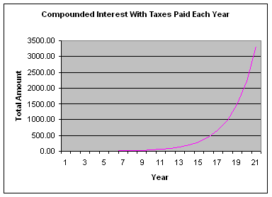
That’s an amazing difference of $524,288.50 or 99.4%! WOW! This really helps to explain why most investors take advantage of the 1031exchange in the US, or that they refinance their properties to buy new properties (no capital appreciation in this case since you haven’t sold the property, all you’ve actually done is shuffle your debt on the property).
In this perspective, commissions on real estate sales for example don’t seem as significant. Are we indeed spending too much time saving pennies? Compare that potential saving and benefit of holding a property for a long period of time. There is no better way to increase your real rate of return than to purchase properties with consistent growth over long periods of time!
Permalink to this article Discussions (2)
| « PREVIOUS PAGE |